
Pharmacy App Mobile Redesign
CVS Health
Goal:
The goal of this project was to redesign the CVS Health mobile app in order to provide users of with cognitive and visual impairments due to age an accessible and simple experience.
Process:
Redesigned new user account setup, card linking, and prescription refilling flows, from initial user research through iterative mobile design.

Role
UX Researcher,
UX Designer
Methods
Survey, Expert Review, Literature Review, Usability Testing
Tools
Sketches, Balsamiq,
Figma
Overview
With 90% of older adults (ages 55+) taking an average of 1-5 prescription drugs daily, it is imperative that they have easy access to getting and refilling their prescription medication.
With this in mind, the goal of this project was to redesign the CVS Health mobile app in order to provide users of this demographic an accessible and simple experience. Our team focused on both new user account creation and viewing and refilling prescriptions.
My Role
My role during this project was as a UX Designer and UX Researcher on a team of 4.
I was involved with each stage of the process, which included:
-
Expert review
-
Usability testing of current app
-
Literature Review
-
Competitive Analysis
-
Sketching and wireframing
-
Prototyping
The Process
Expert Review
The team conducted an expert review of the current CVS Health mobile app in order to help identify any opportunities for improvement for our target users.
Usability Testing
In parallel with the expert review, the team held 5 usability tests with participants ages 55+ to further explore and uncover any additional insights with the CVS Health mobile app.
Literature Review
To better understand the challenges of prescription management with our target demographic (individuals ages 55+), the team conducted a literature review.
Competitive Analysis
The team did a competitive analysis of other medical mobile applications. These mobile apps included Partner’s Patient Gateway and Amazon's PillPack.
Personas
Based on the data collected from our initial user research, two personas were created: the "Coupon Shopper" and the "Traditionalist".
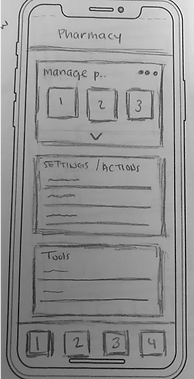
Sketching
After developing our personas, the team sketched out ideas and created a group vision for our mobile design.
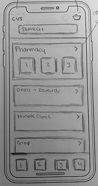
Wireframing
With the sketches finalized, we designed a low-fidelity clickable prototype in Balsamiq. This process was iterative, as simplifying our design was essential to our target users.
Final Prototype Design
Based on feedback of our wireframes, we designed a high-fidelity clickable prototype in Figma. This used branding that was consistent with CVS Health's branding guidelines.
The Design
The below design shows examples of mobile screens, from sketching through wireframing in Balsamiq, to the final prototype in Figma.
Some primary areas of focus:
-
For new users creating accounts, complexity was removed by decreasing the number of text inputs.
-
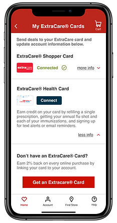
A streamlined process of connecting and disconnecting ExtraCare cards to a user’s account was added.
-
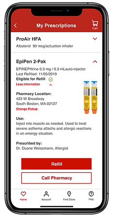
Simplicity was added to the prescription pages by removing redundancy and confusing iconography, as well as minimizing the number of steps in the prescription refilling process.
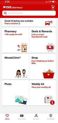
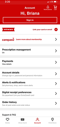
Current Design

Redesigned Screens


Limitations and Challenges
Throughout the project, limitations and challenges arose, such as:
-
CVS customers have the ability to have multiple accounts (e.g. one for ExtraCare and one for the pharmacy) which causes confusion and disruption in the overall user experience on the CVS mobile application.
-
Time constraints which limited the ability to conduct additional rounds of interviews and usability testing
Results and Reflection
Through our final redesign of CVS Health's mobile application, we were able to enhance the overall user experience by only showing necessary and relevant information to the user. By providing the user simple interactions, easier information inputting, and clear system messaging, the team was able to effectively design an app that is discoverable and efficient for our target users (adults ages 50+).
If the team were to continue the project past the final deliverable, some next steps would include:
-
Conduct concept testing in order measure first impressions and interactions - specifically to understand the time and number of clicks required to complete important tasks.
-
Continuing to evolve the design of our prototype based on additional user feedback through usability testing.